WELCOME TO THE NCC ART ROOM

!!!! WELCOME TO THE NCC ART ROOM !!!!

Hi there! This is a new experiment Mr.Craig is going to try as an even easier way of bringing you examples of student work and to keep his image set organized and useful. Let me know if you are using it, if you find any problems or dead links and if there is anything you would like to see!
Showing posts with label Pencil Crayon. Show all posts

Wednesday, May 25, 2016

Character design process

Here is a really awesome article on Character design from the folks at Privateer press - I want you to see the connections between the process shown here and what you are doing in your own projects.

http://privateerpress.com/community/privateer-insider/insider-04-29-2016

This is the type of process I want you to try out!


Another incredible article from PIXAR http://pixar-animation.weebly.com/character-design.html which includes the following:

Pixar's Tips For Designing a Successful Character

When a Pixar artist is designing a character there are a number of areas they explore to ensure a successful character design.
Research and evaluate
It can be helpful to try and deconstruct why certain characters and their characteristics work and why some don't. 
 Study other characters and think about what makes some successful and what in particular you like about them.

Who is it aimed at?
Think about your audience. Characters aimed at young children, for example, are typically designed around basic shapes and bright colours. 
Visual impact
Whether you're creating a monkey, robot or monster, you can guarantee there are going to be a hundred other similar creations out there. Your character needs to be strong and interesting in a visual sense to get people's attention. 

Exaggerated characteristics
Exaggerating the defining features of your character will help it appear larger than life. Exaggerated features will also help viewers to identify the character's key qualities.


Colour
Colours can help communicate a character's personality. Typically, dark colours such as black, purples and greys depict baddies with malevolent intentions. Light colours such as white, blues, pinks and yellows express innocence, good and purity.


Conveying personality
Interesting looks alone do not necessarily make for a good character; its personality is key as well. A character's personality can be revealed through animations, where we see how it reacts to certain situations. The personality of your character doesn't have to be particularly agreeable, but it does need to be interesting (unless your characters is purposely dull).

Express yourself
Expressions showing a character's range of emotions and depicting its ups and downs will further flesh out your character. Depending on its personality, a figure's emotions might be muted and wry or explosive and wildly exaggerated.


Goals and dreams
The driving force behind a character's personality is what it wants to achieve. TOften the incompleteness or flaws in a character are what make it interesting.


Building back stories
If you're planning for your character to exist within comics and animations then developing its back story is important. Where it comes from, how it came to exist and any life-changing events it has experienced are going to help back up the solidity of, and subsequent belief in, your character. Sometimes the telling of a character's back story can be more interesting than the character's present adventures.


Beyond the character
In the same way that you create a history for your character, you need to create an environment for it to help further cement believability in your creation. The world in which the character lives and interacts should in some way make sense to who the character is and what it gets up to.


Fine-tuning a figure
Question each element of your creation, especially things such as its facial features. The slightest alteration can have a great effect on how your character is perceived.


Friday, October 2, 2015

Grade 10/11 Pencil Crayon/Colour Overlay Examples


Grade 10 Animal Drawing Project Part 2 - Process

Once you have chosen you animal image it needs to be drawn onto the assigned paper. Depending on the class this may mean on good quality paper or even illustration board. Whatever paper you are assigned - it is Mr.Craig's expectation that you will enlarge the image you have chosen to fit the majority of the surface provided to you.

There are several ways to enlarge and prepare an image for colour work. Please do remember that we are trying to develop a number of skills simultaneously here - drawing, enlarging, proportion, simplification, colour matching and colour overlay. The last two are the most important aspects in this particular project, though it the drawing is inaccurate there will be no hiding that behind even the most exquisite colour work.

I suggest the use of a graphite transfer or (preferably) a grid approach to enlarging the image. The latter definitely requires a ruler and some thought, but it is a traditional skill that can benefit you in the years to come. We will discuss the grid in class and Mr. Craig will be happy to help you figure out grid ratios and if there is a need to crop. Try to stick to whole numbers (such as 2 cm or 1 inch squares) or easy to use fractions (1.5 inch for example) where possible when gridding.

Here is a great example of a complex picture developed using a grid and the proper pencil crayon overlay techniques. Note how the background has been somewhat simplified to create greater focus on the primary focal pint. Just a beautiful piece.


Tuesday, September 22, 2015

Collaborative project 2k15


Here we go again! In the ongoing series of really successful collaborations, this year's group has chosen the most dynamic image yet. This is going to be fantastic. The printed image given them was 15x24 cm broken into 18 4x5 cm rectangles - they are each taking responsibility to blow one of those up to an 8x10 inch canvas I have provided them. The overall structural integrity and alignment of the image must be maintained, but the surface treatments, colours etc. are completely up to the individual student!  Cant wait to see this come together.

Students - check the collaboration tag to see your rubric.

Friday, October 3, 2014

Grade 10 Animal Drawing Project Part 1 - Example starting images


As a part of our unit culminating task students are required to bring in an animal photo from
which to work. Here are some examples of great photos that could be the starting point for the student projects.

Note the strong contrast and rich colour palettes. This is something that will be of great value in choosing the best images for this project.


Ask me why this last one is probably not a great choice.... you may be surprised

Monday, September 9, 2013

Grade 10/11 - Colour Blending Chart


This project will give you the maximum variations of colour overlay mixtures available in your pencil crayon set and to really learn the abilities and limitations of your specific tool set. This is the key opportunity for you to train your muscle memory by practice proper technique until it becomes second nature. If you find that you have individual boxes that are not to the same level of quality as others - do NOT scrap things and start again! See Mr. Craig for a helpful tip on making adjustments instead! (Remember that whole "I am here to help" speech?) On the other hand, I will also remind you of the resubmission policy should you feel the need to redo this at a later date (after you have become more practiced some students realise they could redo this in a fraction of the time with a great deal more skill).  Do not be surprised if your grid looks different than those of your peers. This is an art - not a science - and people will have different results based on factors such as the amount of pressure they use, the number of layers they need to create their gradation, the brand of pencil crayon they have, even little things like how sharp they keep their pencils! As long as you are creating smooth gradients and proper layers you will do just great!

 The colour blending chart is completed in 3 steps:

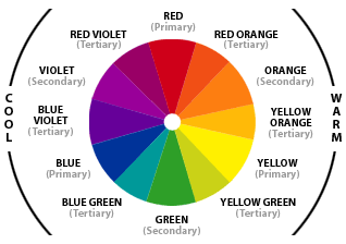
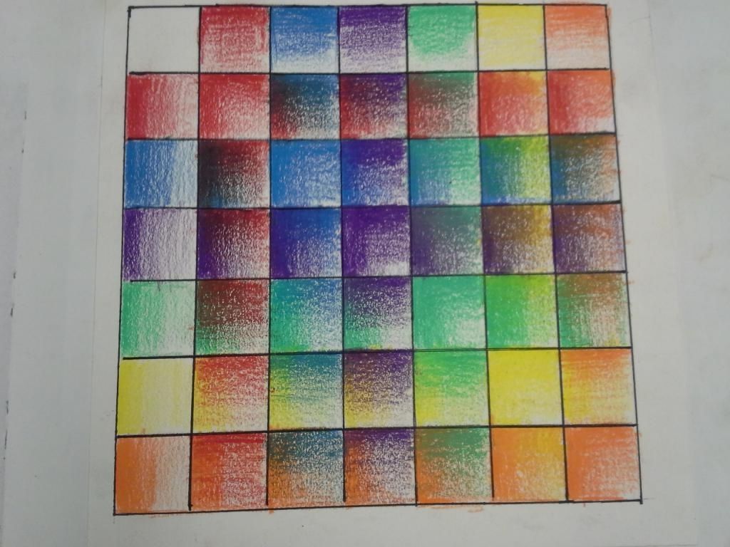
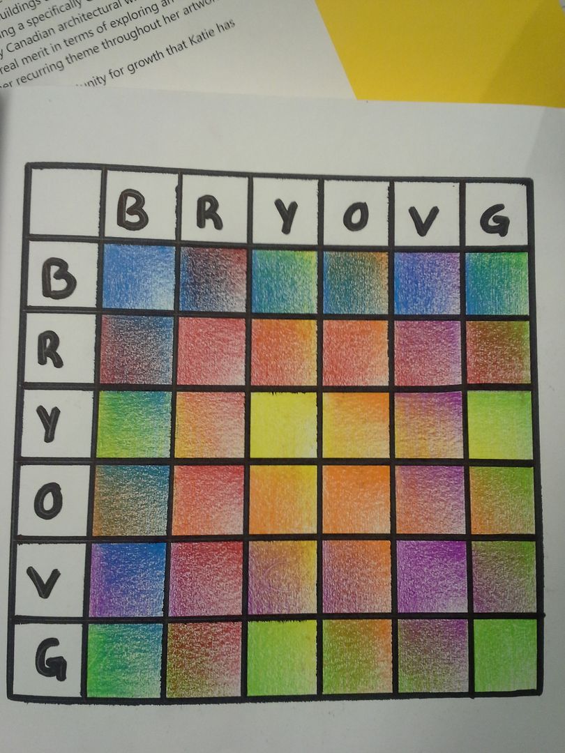
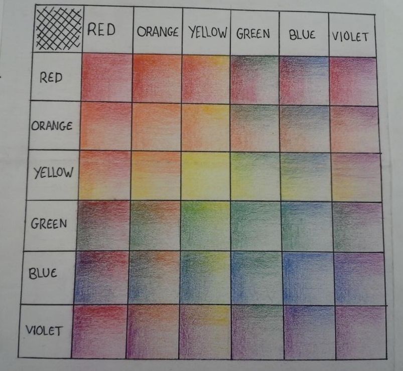
Step#1 - Create a Grid of 7x7 squares. Squares should be 2cm/1inch each. Measure your sketchbook page in advance to make sure it fits properly. USE A RULER!!!! The first row and column should include matching labels for the 3 primary and 3 secondary colours (ROYGBV). The top left hand corner is blank. I will be looking for even measurements and attention to accuracy.

Step#2 - COMPLETE ALL ROWS FIRST!!!. Using colour overlay, you will create smooth gradients of colour from left to right in each box. The colours will correspond to the row labels. (a row of red gradients, a row of orange gradients, etc.). This is an enormous amount of work and you may find it quite difficult to maintain consistency between boxes and rows - but this is your goal. I will be looking for consistency, proper overlay technique, consistency, smooth gradations and... did I mention consistency? (NOTE: For the reasons we will discuss in class you will be given a greater deal of latitude with Yellow gradations. Do not stress if you feel that this line is not on par with the others.)

Step #3 - Once you have completed ALL the rows, you will repeat the same techniques for gradation and colour overlay following the columns overtop of your finished rows. Gradients will this time be created from top to bottom. I will be looking for the same accuracy of technique, consistency and smooth gradations as step two. Don't get sloppy/lazy now!!!! Push through to the end and find the success you deserve!

EXAMPLES OF FINISHED GRIDS