WELCOME TO THE NCC ART ROOM

!!!! WELCOME TO THE NCC ART ROOM !!!!

Hi there! This is a new experiment Mr.Craig is going to try as an even easier way of bringing you examples of student work and to keep his image set organized and useful. Let me know if you are using it, if you find any problems or dead links and if there is anything you would like to see!
Showing posts with label Project. Show all posts

Wednesday, May 25, 2016

Character design process

Here is a really awesome article on Character design from the folks at Privateer press - I want you to see the connections between the process shown here and what you are doing in your own projects.

http://privateerpress.com/community/privateer-insider/insider-04-29-2016

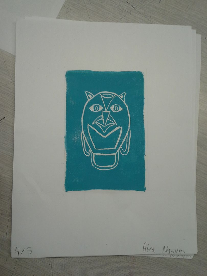
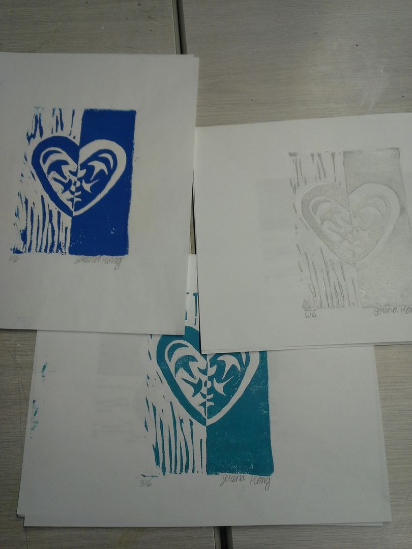
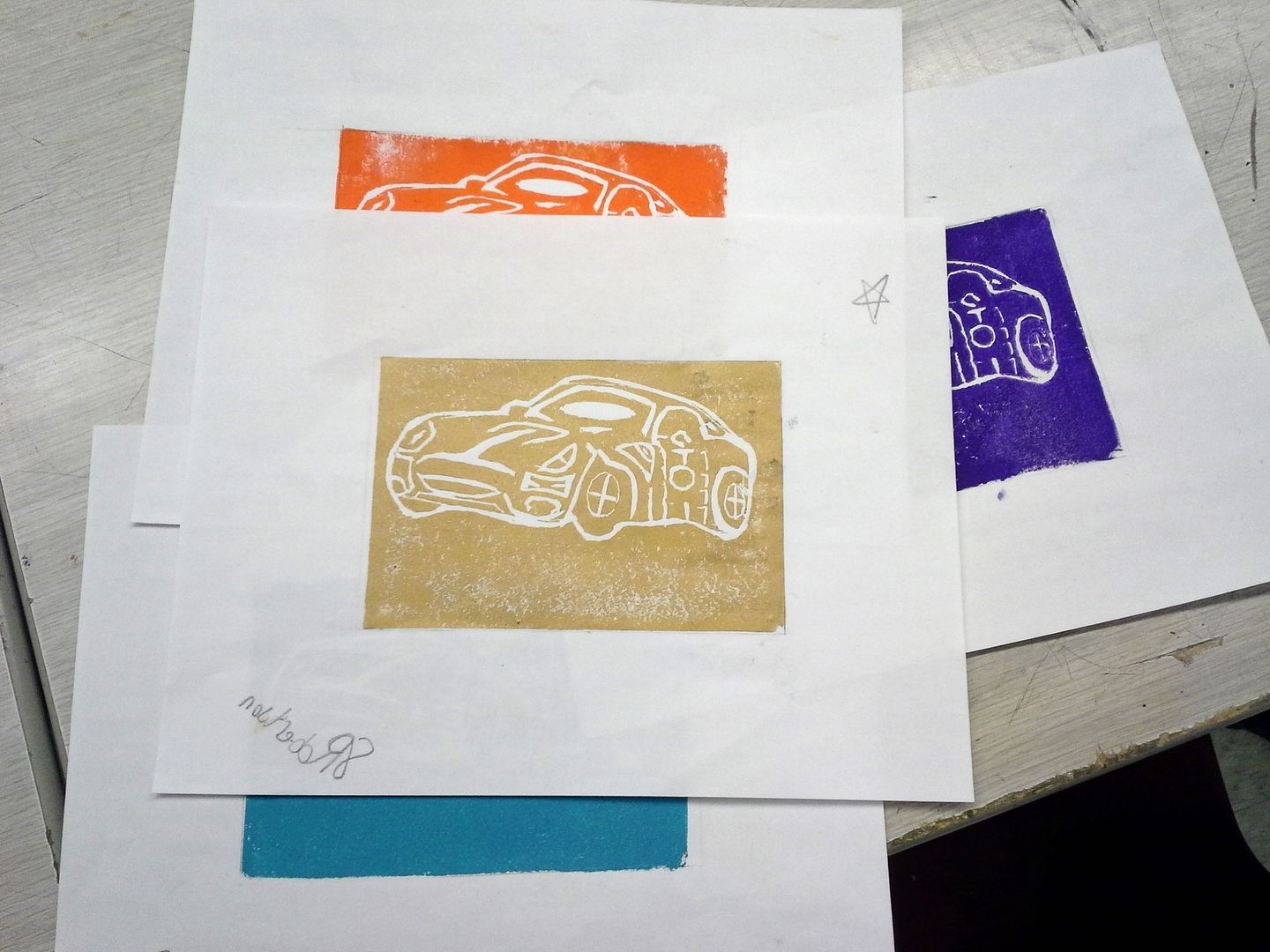
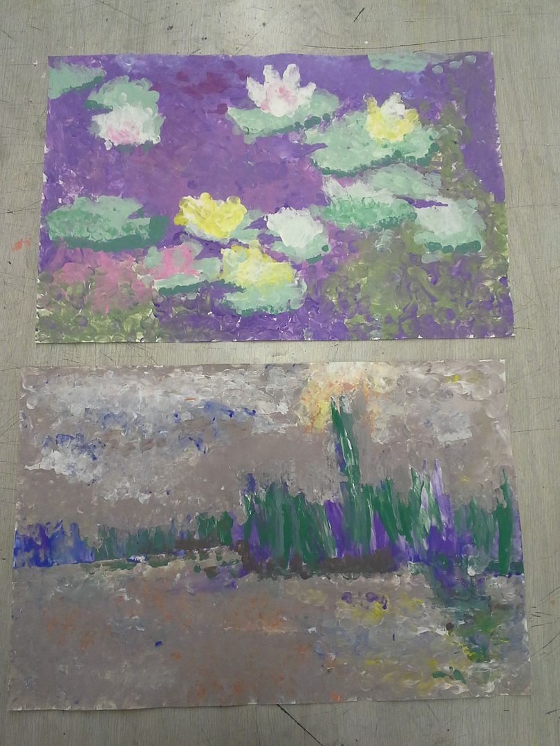
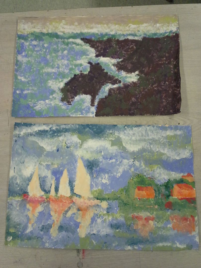
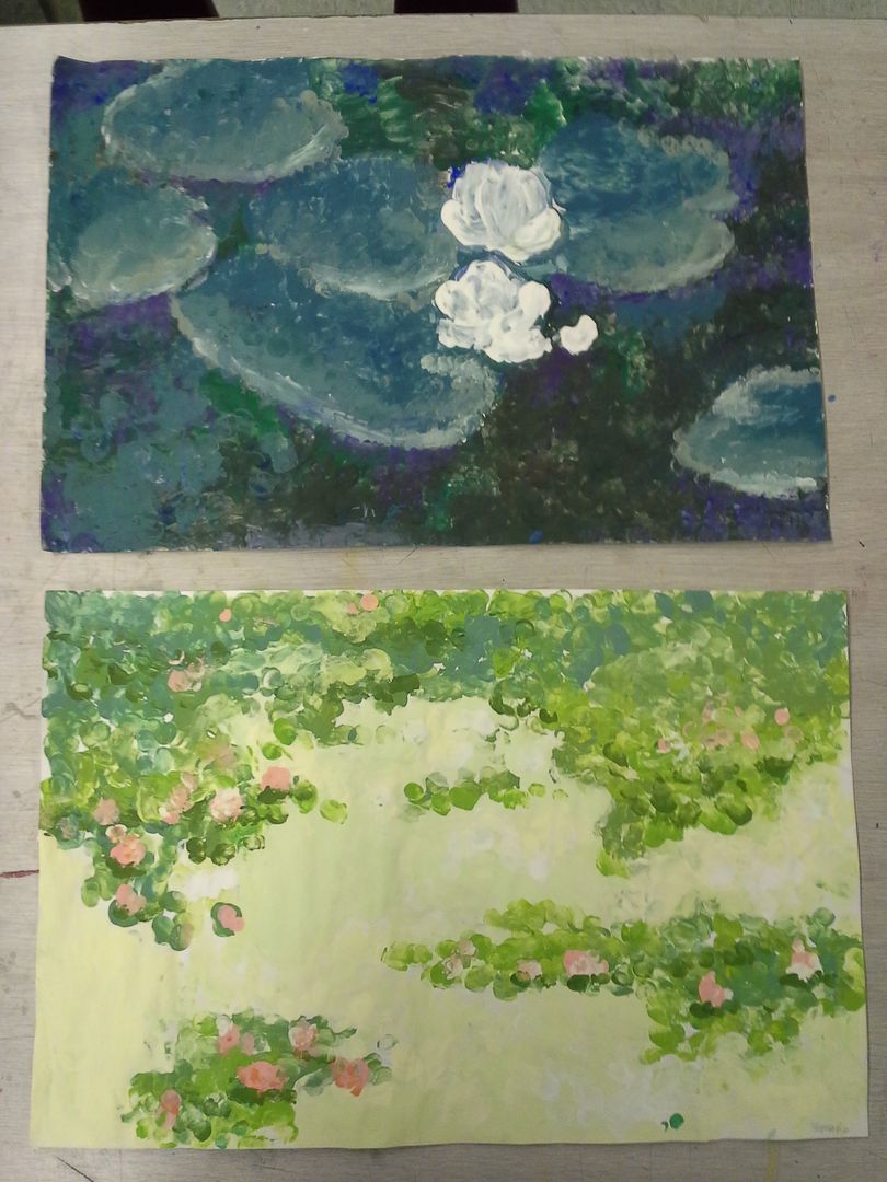
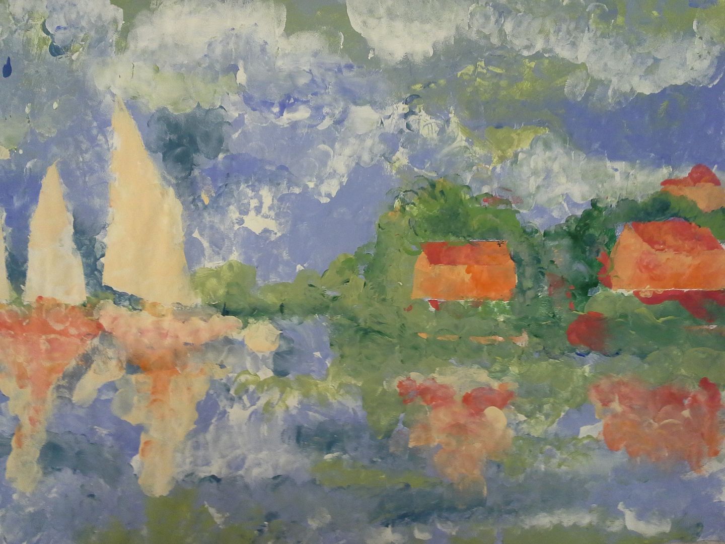
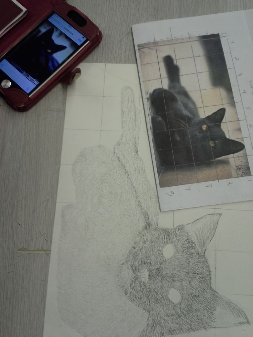
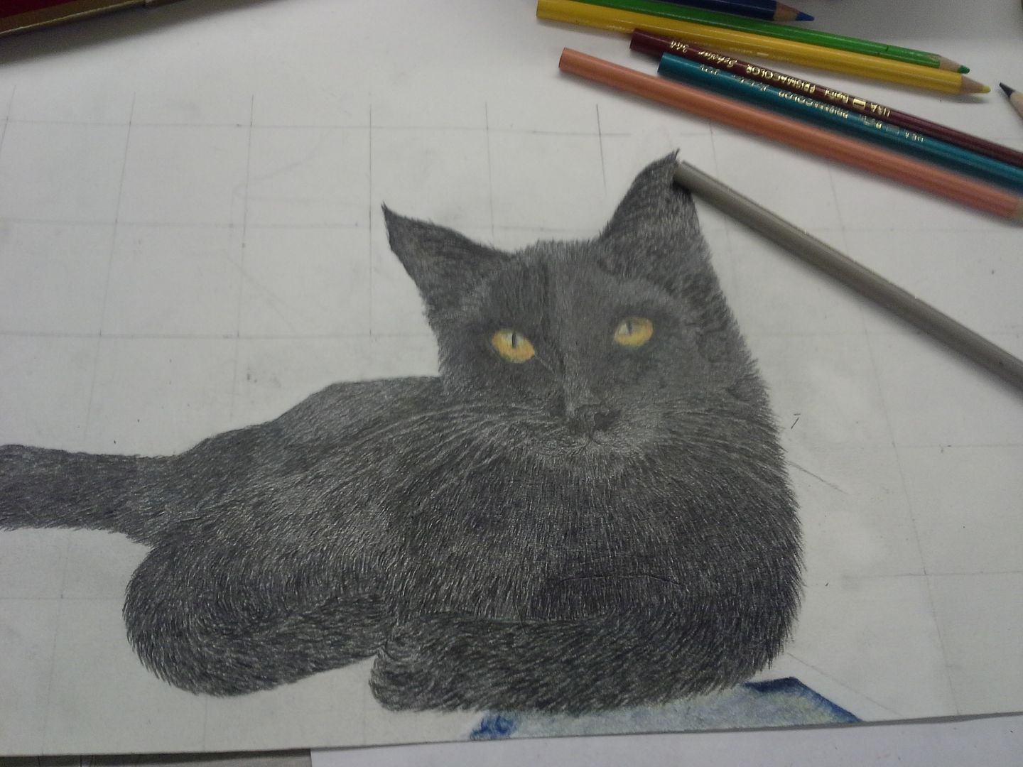
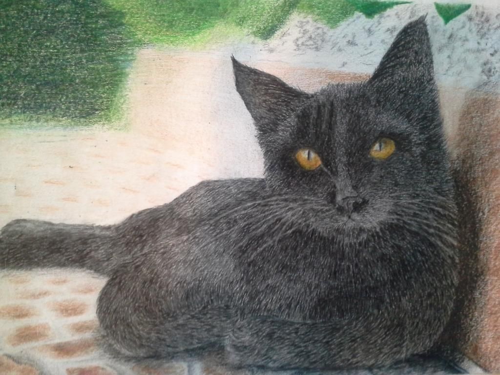
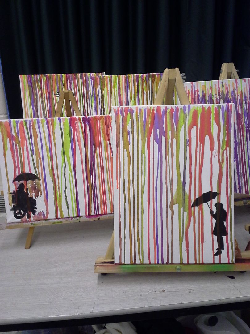
This is the type of process I want you to try out!


Another incredible article from PIXAR http://pixar-animation.weebly.com/character-design.html which includes the following:

Pixar's Tips For Designing a Successful Character

When a Pixar artist is designing a character there are a number of areas they explore to ensure a successful character design.
Research and evaluate
It can be helpful to try and deconstruct why certain characters and their characteristics work and why some don't. 
 Study other characters and think about what makes some successful and what in particular you like about them.

Who is it aimed at?
Think about your audience. Characters aimed at young children, for example, are typically designed around basic shapes and bright colours. 
Visual impact
Whether you're creating a monkey, robot or monster, you can guarantee there are going to be a hundred other similar creations out there. Your character needs to be strong and interesting in a visual sense to get people's attention. 

Exaggerated characteristics
Exaggerating the defining features of your character will help it appear larger than life. Exaggerated features will also help viewers to identify the character's key qualities.


Colour
Colours can help communicate a character's personality. Typically, dark colours such as black, purples and greys depict baddies with malevolent intentions. Light colours such as white, blues, pinks and yellows express innocence, good and purity.


Conveying personality
Interesting looks alone do not necessarily make for a good character; its personality is key as well. A character's personality can be revealed through animations, where we see how it reacts to certain situations. The personality of your character doesn't have to be particularly agreeable, but it does need to be interesting (unless your characters is purposely dull).

Express yourself
Expressions showing a character's range of emotions and depicting its ups and downs will further flesh out your character. Depending on its personality, a figure's emotions might be muted and wry or explosive and wildly exaggerated.


Goals and dreams
The driving force behind a character's personality is what it wants to achieve. TOften the incompleteness or flaws in a character are what make it interesting.


Building back stories
If you're planning for your character to exist within comics and animations then developing its back story is important. Where it comes from, how it came to exist and any life-changing events it has experienced are going to help back up the solidity of, and subsequent belief in, your character. Sometimes the telling of a character's back story can be more interesting than the character's present adventures.


Beyond the character
In the same way that you create a history for your character, you need to create an environment for it to help further cement believability in your creation. The world in which the character lives and interacts should in some way make sense to who the character is and what it gets up to.


Fine-tuning a figure
Question each element of your creation, especially things such as its facial features. The slightest alteration can have a great effect on how your character is perceived.


Thursday, October 15, 2015

Compositional Gauntlet

 Compositional studies

You must complete 12 of the following pieces in your sketchbook. Please focus on creating strong and interesting compositions. You may use photography for up to a maximum of half (6) of the pieces.

Each picture must be at least 4" x 4"

1. Formal Line (contour) Organic
2. Informal Line Organic
3. Formal Line Inorganic
4. Informal Line Inorganic
5. Formal Line Negative space
6. Informal Line negative space
7. Formal Colour Organic
8. Informal Colour Organic
9. Formal Colour Inorganic
10. Informal Colour Inorganic
11. Formal Colour Negative Space
12. Informal Colour Negative Space
13. Formal Shaded Organic
14. Informal Shaded Organic
15. Formal Shaded Inorganic
16. Informal Shaded Inorganic
17. Formal Shaded Negative Space
18. Informal Shaded Negative Space

Formal : Focal point centered, Closed, Symmetrical, Visual movement is horizontal/vertical/circular, Visually calm
Informal : Focal point off-center, Open, Asymmetric, Visual movement is diagonal/random/elliptical, Visually tense


Definition of "organic" (ref dictionary.com):
Fine Arts - of or pertaining to the shapes or forms in a work of art that are of irregular contour and seem to resemble or suggest forms found in nature.

12/IB Self Portrait Rubric

Click on the image below to make it larger/easier to read :)


Friday, October 2, 2015

Crepe Painting


For these we took crepe and tissue paper and ripped it into tiny pieces. I showed the kids many images of landscape and either let them choose one they liked or provided them with an image which was graphite transferred onto water colour paper before their arrival the next day. on day 2 they started to lay the strips of ripped paper onto their pictures using a soft brush and water. The water causes the dye from the paper to bleed out and after a few moments they would remove the tissue paper revealing an interesting watercolour like finish made by the leftover dyes. This was then left to dry overnight and was completed over a  few days.
 
here you can see the layers of tissue sitting on the "grassy" part of the page.


Super fun - and some beautiful images. Many of the kids were really proud!

Pacific North West Coast Printmaking Research Day

Start here:

https://www.youtube.com/watch?v=1bUesL4MDas

The above video is very important in explaining the overal process. You NEED to watch this please.
Remember that the Blocks you will be using are 10cm x 15cm

a block carving in process.
Next look back at this:

http://nccart.blogspot.ca/2014/12/pacific-northwest-coast-design-project.html

This will give you some info about the project and links to videos etc. about PNWC design. We looked at this briefly in class but I would like you to revisit it


Don't forget the Salish forms we discussed in class that are not covered by the hand out!
The Triskele (curved three pointed form),
and Crescent are important Salish parts of the form language that can add beautiful flow and pattern to a design.

Here are some examples of pieces done by students in previous classes - scroll all the way down to get the last of the info ;)

Baymax reimagined
Owl

I like the inclusion of textural marks in this one


Now your job is to come up with your own design. Keep in mind that the highest marks result from originality and adaptation of design - here is the rubric we looked at yesterday to reinforce your understanding :
Click to make it bigger

Fingerprint Impressionism

Students chose images from the impressionist books I had on hand in the class. We Got out some water colour paper and prepared small minimal palettes of tempera (with the intent of developing these in steps and layers so as not to produce muddy results). We then used only the dabbing actions of our fingers to make our own versions of these famous paintings. In a few cases we also used some masking tape to protect zones and give a greater sense of a more solid shape (as in the orange houses for example). This was successful beyond any expectation and the students loved it as well. They were competed over several days.


Grade 10 Animal Drawing Project Part 2 - Process

Once you have chosen you animal image it needs to be drawn onto the assigned paper. Depending on the class this may mean on good quality paper or even illustration board. Whatever paper you are assigned - it is Mr.Craig's expectation that you will enlarge the image you have chosen to fit the majority of the surface provided to you.

There are several ways to enlarge and prepare an image for colour work. Please do remember that we are trying to develop a number of skills simultaneously here - drawing, enlarging, proportion, simplification, colour matching and colour overlay. The last two are the most important aspects in this particular project, though it the drawing is inaccurate there will be no hiding that behind even the most exquisite colour work.

I suggest the use of a graphite transfer or (preferably) a grid approach to enlarging the image. The latter definitely requires a ruler and some thought, but it is a traditional skill that can benefit you in the years to come. We will discuss the grid in class and Mr. Craig will be happy to help you figure out grid ratios and if there is a need to crop. Try to stick to whole numbers (such as 2 cm or 1 inch squares) or easy to use fractions (1.5 inch for example) where possible when gridding.

Here is a great example of a complex picture developed using a grid and the proper pencil crayon overlay techniques. Note how the background has been somewhat simplified to create greater focus on the primary focal pint. Just a beautiful piece.


Monday, June 1, 2015

IB External Assessment 2 - Process Portfolio - the evolution of the RWB!

External assessment task #2 - Process Portfolio
Part 2: Process portfolio 40%
EXAMPLES FROM IB: 1, 2, 3
 
"All students should use their visual arts journal to carry out their explorations with techniques, technologies, effects and processes and to record their discoveries. They should chart and reflect on their experiments with media, their decision-making and formation of artistic intentions. Students will select, adapt and present what they have recorded in their journal as the basis for material submitted for the process portfolio task." Weighting: 40%
 
 
Students at SL and HL submit carefully selected materials which demonstrate their experimentation, exploration, manipulation and refinement of a variety of visual arts activities during the two-year course. The work, which may be extracted from their visual arts journal and other sketch books, notebooks, folios and so on, should have led to the creation of both resolved and unresolved works. The selected process portfolio work should show evidence of their technical accomplishment during the visual arts course and an understanding of the use of materials, ideas and practices appropriate to visual communication. They should be carefully selected to match the requirements of the assessment criteria at the highest possible level.

The work selected for submission should show how students have explored and worked with a variety of techniques, effects and processes in order to extend their art-making skills base. This will include focused, experimental, developmental, observational, skill-based, reflective, imaginative and creative experiments which may have led to refined outcomes.


Structuring the process portfolio

Students will have pursued their own interests, ideas and strengths, and their submitted work should highlight the key milestones in this journey. The submission may come from scanned pages, photographs or digital files. The process portfolio screens may take a variety of forms, such as sketches, images, digital drawings, photographs or text. While there is no limit to the number of items students may wish to include on each screen, students should be reminded that overcrowded or illegible materials may result in examiners being unable to interpret and understand their intentions.


The selected screens should evidence a sustained inquiry into the techniques the student has used for making art, the way in which they have experimented, explored, manipulated and refined materials, technologies and techniques and how these have been applied to developing work. Students should show where they have made independent decisions about the choices of media, form and purpose that are appropriate to their intentions. The portfolio should communicate their investigation, development of ideas and artworks and evidence a synthesis of ideas and media. This process will have inevitably resulted in both resolved and unresolved artworks and candidates should consider their successes and failures as equally valuable learning experiences.


Examiners are looking to reward evidence of the following:


  1. sustained experimentation and manipulation of a variety of media and techniques and an ability to select art-making materials and media appropriate to stated intentions
  2. sustained working that has been informed by critical investigation of artists, artworks and artistic genres and evidence of how these have influenced and impacted own practice
  3. how initial ideas and intentions have been formed and how connections have been made between skills, chosen media and ideas
  4. how ideas, skills, processes and techniques are reviewed and refined along with reflection on the acquisition of skills and analysis of development as a visual artist
  5. how the submitted screens are clearly and coherently presented with competent and consistent use of appropriate subject-specific language.

Students must ensure that their work makes effective use of appropriate subject-specific language.

Art-making forms
 
For SL students the submitted work must be in at least two art-making forms, each from separate columns of the table below. For HL students the submitted work must have been created in at least three art-making forms, selected from a minimum of two columns of the art-making forms table below. The examples given are for guidance only and are not intended to represent a definitive list.


Submitted work might well include experiments undertaken during (and reflections upon) taster sessions in particular media, demonstrations of techniques, workshops, master classes, guided experimentation and studio practice experienced as part of the core syllabus activities outlined above.
Formal requirements of the task—HL  
 
HL students submit 13–25 screens which evidence their sustained experimentation, exploration, manipulation and refinement of a variety of art-making activities. For HL students the submitted work must have been created in at least three art-making forms, selected from a minimum of two columns of the art-making forms table.


Submitting assessment work

The submitted screens must not include any resolved works submitted for part 3: exhibition assessment task.


The size and format of screens submitted for assessment is not prescribed. Submitted materials are assessed on screen and students must ensure that their work is clear and legible when presented in a digital, on-screen format. Students should not scan multiple pages of work from their journals and submit them as a single screen, for example, as overcrowded or illegible materials may result in examiners being unable to interpret and understand the intentions of the work. The procedure for submitting work for assessment can be found in the Handbook of procedures for the Diploma Programme. Students are required to indicate the number of screens when the materials are submitted. Where submitted materials exceed the prescribed screen limits examiners are instructed to base their assessment solely on the materials that appear within the limits.


IB - External Assessment 1 - Comparative Study Info


IB External Assessment Task #1
Part 1: Comparative study
Weighting: 20%
EXAMPLES FROM IB: 1, 2, 3


Students are required to analyse and compare artworks, objects or artifacts by different artists. This independent critical and contextual investigation should explore artworks, objects and artifacts from differing cultural contexts.

Throughout the course, students will have investigated a range of artists, styles, images and objects from a range of cultural contexts, through an integrated approach to exploring the three syllabus areas: visual arts in context, visual arts methods and communicating visual arts. Students select artworks, objects and artifacts for comparison from differing cultural contexts that may have been produced across any of the art-making forms, and that hold individual resonance for the student and have relevance to their own art-making practice. This is of particular importance to HL students.

Students at both SL and HL must examine and compare at least three pieces, at least two of which should be by different artists. It is valuable for students to have experienced at least one of the works in real time and space, such as a painting at a gallery, a sculpture in a park or an artifact from the local community that is brought into the school, although this is not essential. Good quality reproductions can be referred to when a student’s location limits their access to such works first hand. The works selected for comparison and analysis should come from contrasting cultural contexts.
Students use research and inquiry skills to investigate and interpret the selected pieces, applying aspects of critical theory and methodologies to the works examined and presenting their findings as a personal and critically reflective analysis, using both visual and written forms of notation. Students must support their interpretation with references to sound and reliable sources. A recognized system of academic referencing must be used in line with the school’s academic honesty policy. A candidate’s failure to acknowledge a source will be investigated by the IB as a potential breach of regulations that may result in a penalty imposed by the IB final award committee.


Students then undertake the process outlined below for assessment.
Task details
Students at both SL and HL must select at least three artworks, objects or artifacts, at least two of which should be by different artists. For each of the selected pieces, students should:

  1. carry out research from a range of different sources
  2. analyse the cultural contexts in which the selected pieces were created
  3. identify the formal qualities of the selected pieces
  4. interpret the function and purpose of the selected pieces
  5. evaluate the material, conceptual and cultural significance of the selected pieces to the cultural contexts within which they were created.

Students at both SL and HL should then:

  1. compare the selected pieces, identifying links in cultural context, formal qualities, function, purpose, material, conceptual and cultural significance
  2. present a list of sources used during the study.

Students at HL should also reflect on the investigation outcomes and the extent to which their own art-making practices and pieces have subsequently been influenced by artworks, objects or artifacts examined in the comparative study.

The role of the teacher
 
Teachers must ensure that their students are appropriately prepared for the demands of this task through the careful planning and delivery of the core syllabus activities outlined above. This assessment task must not be teacher led and students should be made fully aware of the assessment criteria against which their work will be judged.

The teacher should discuss the choice of selected artworks, objects and artifacts with each student. It is important that the selected pieces are the student’s own choice. Teachers should also ensure that the students are acknowledging all sources used and referencing them appropriately.

Teachers should read and give advice to students on one draft of the comparative study. The teacher should provide oral or written advice on how the comparative study could be improved, but should not edit the draft. The next version handed to the teacher must be the final version for submission.
 
Structuring the comparative study
 
Students should articulate their understanding through both visual and written forms, depending on the most appropriate means of presenting and communicating their findings. While the comparative study may include text-based analysis, it may also include diagrammatic and graphic elements such as annotated sketches and diagrams, annotations on copies of artworks as well as other visual organizing techniques (such as flowcharts, relative importance graphs, concept webs and Mind Maps®). An introduction to the study should summarize the scope of the investigation from which the focus artworks, objects and artifacts have been selected. Students should aim for a balance of visual and written content, and use an appropriate means of acknowledging sources. Students must ensure that their work makes effective use of subject-specific language where appropriate.

For each of the selected artworks, objects or artifacts, students at both SL and HL are encouraged to focus their analysis and interpretation of works through consideration of the role of the artist, the artwork, the audience and the cultural context. The scope and scale of the comparative study task will depend largely on the materials selected for investigation. Students may wish, however, to adapt the following structure to suit their needs. This structure is for guidance only and is neither prescriptive nor restrictive.

 
Formal requirements of the task—HL
 
  1. HL students submit 10–15 screens which examine and compare at least three artworks, objects or artifacts, at least two of which need to be by different artists. The works selected for comparison and analysis should come from differing cultural contexts.
  2. HL students submit 3–5 screens which analyse the extent to which their work and practices have been influenced by the art and artists examined.
  3. HL students submit a list of sources used.

Submitting assessment work
 
The size and format of screens submitted for assessment is not prescribed. Submitted materials are assessed on screen and students must ensure that their work is clear and legible when presented in a digital, on-screen format. Students should not scan multiple pages of work from their journals and submit them as a single screen, for example, as overcrowded or illegible materials may result in examiners being unable to interpret and understand the intentions of the work.
 
The procedure for submitting work for assessment can be found in the Handbook of procedures for the Diploma Programme. Students are required to indicate the number of screens included when the materials are submitted. Where submitted materials exceed the prescribed screen limits examiners are instructed to base their assessment solely on the materials that appear within the limits.


Monday, April 20, 2015

dripping paint

PAINT DRIP TABLE | BY JOHN NOUANESING


The "Paint or Die But Love Me” Table designed by John Nouanesing seems to be melting. And if not melting, than not even solid in the first place, but rather a paint spill suspended in motion. It´s too bad we can´t order one, so far it’s only in the conceptual art stage because Mr. Craig would LOVE one of these for his house!


Since we are on the topic of dripping paint (and it just so happens that it is a terribly rainy day as I write this!) Check out these dripping paint rain drops!


So Here is the plan for today, - we are going to do photos of ourselves with umbrellas and then we will start preparing out boards for paint!!!!

When everything is ready we will do graphite transfers to add our silhouettes and make our own drippy rainstorms!

Here are some shots of the work by the Dev Class - we used photos as a starting point, graphite transferred them, painted in the silhouette and then used pipettes to drip the paint. Tonnes of fun.


Tuesday, April 14, 2015

Colour Chasing part 1

THIS ONE WAS AN ENORMOUS HIT WITH MY STUDENTS!!!!!! SHARE IT AROUND!!!!!
Adapted from Adventures in Art

"The color field painter Morris Louis inspired this project. I saw a great show of his work last year in D.C. He stuff is so subtle and beautiful; I could stare at it all day. "


"In my student’s version I taped down normal white paper to larger
pieces of cardboard. Large drops of liquid watercolor were then added to the paper. The students raised the cardboard on one side till the paint ran over to the opposite side and then repeated this till the paint was absorbed. The students worked with one color at a time. What I love about these paintings is that each one turned out so different."


Wednesday, September 10, 2014

First Nations of Canada part1: Research


Day 1.   Pre-reading for context
  •  Pre-reading - Textbook – pages 244- 253
  • Complete all vocabulary and questions 1-4 on 253 and 1-5 on 263
Day 2: Regional Studies

  • Brief recap. Refer to map in textbook and the concept of organizing groups along cultural/linguistic lines. 
  • Students will be asked to choose one of the groups listed (or these may be assigned to ensure that all groups are represented)
 
Students will complete a two paragraph research project. They will be given 2 periods of class time after which the remainder must be completed for homework. They will be pointed towards http://firstpeoplesofcanada.com/  as an excellent starting point though they must use at least 2 more sources.
 
  • Paragraph 1 deals with explaining a few key fundamentals about the identity of a group:  Who? Where? Noteworthy individuals (artists)? Cultural features?

  • Paragraph 2 is a discussion just of the Art of the people and region: What were some of the major styles/media traditionally used and defining features of the art/style? Dominant symbols/meaning should be covered here. Also note whether the art forms of this region are generally religious or secular (or if both are well represented).

  • Part 3 –> include 3 clear pictures that display examples of artworks from this region.

This document should be typed.
 
I request that the digital file be emailed to nccart@gmail.com so that I can collate the best of the information and examples to form a single document that will be posted for everyone to use.

Collaborative Composition Rubric


Collaborative Composition Rubric
4
3
2
1
Creativity,  Originality and adaptability of design.
Original design showing unique artist-driven vision. The student thinks reflectively and creatively to evaluate concepts and solve design problems. Canvas works exceptionally well as both a singular surface and as a part of the whole.
Creates original design or original and personal interpretations of an existing design. Shows engagement with the creative process. Connects to prior knowledge and developing personal style. Canvas is notably better as either a singular piece or as a part of the whole but still functions on both levels.
Doesn’t come up with original ideas. Design seems derivative with minimal adaptations made to personalize. Canvas
does not hold up compositionally outside of the collective whole.
Design is poorly planned and lacks both cohesion and personalization.
Design – Contrast/Emphasis, Shape, Line and Unity
This complex design shows excellent use contrast and emphasis to create multiple focal points or “attention grabbing moments” in the design. Painting has a clear, instantly readable and recognizable visual presentation
Emphasis is utilized in order to create a single strong focal point. Shape and line combine to make connections between readily recognizable subjects. Cohesive visual presentation.
Focal point present but shapes/forms are not developed to a point where the subject is readily recognizable understood. Design is not cohesive and lacks unity.
Homogenous finish with little or no clear emphasis. Unclear subject due to limited contrast and underdeveloped forms. Confusing visual presentation.
Surface Finishes (Application of Media techniques)
All surfaces have been finished with great technical skill and consistency.  Skillfully employs multiple techniques and mixes media in a manner which is appropriate to the project concept.
A well-developed surface that shows evidence of competent technique  and proper control of at least one media .  Equal treatment of all surfaces in a single media or inclusion of a second media with less technical acuity.
Inconsistent surfaces that show some evidence of attempts to control chosen media through addressing challenges surface control and/or consistency.   Completed with some areas being more developed than others.
Fails to create a surface that exhibits an understanding of chosen media. Limited evidence of technical refinement or control. Pieces are unfinished and/or surfaces are underdeveloped.
Use of Colour (in the case of non colour treatments substitute "value" for the term "colour"  in descriptors)
Shows a thorough understanding of the role of colour actively exploits colour theory, saturation, contrast, variation and/or temperature to enhance design.
Uses color as a meaningful element of design. Makes clear use of complimentary colours and/or analogous colour contrasts
Begins to consider the role of color as a meaningful element in design. Little or no colour mixing evident. Limited use of the colour wheel evident.
Fails to consider the role of color as a meaningful element in design.
Effort/Perseverance
The project was continued until it was complete as the student could make it; gave it effort far beyond that required and took pride in going well beyond the requirement. Flawless alignment to all adjoining images.
The student finished the project and met expectations for effort and commitment to developing their surfaces and techniques. Sections line up properly to all adjoining images.
Project completed. Image aligns reasonably well with most portions of adjoining canvases.
The project was completed with indifference and minimum collaborative effort. Misaligned in several obvious places.